What Should Go on My Homepage?
One clear message about what you do, who it's for and where, then just enough underneath to help someone get in touch. Most homepages get better by taking things away.
 By Stephen OsmondWebsites and local marketing for small businesses in Belleville and the Quinte region
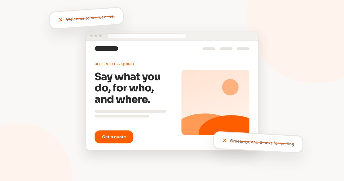
When I look at a small business's homepage for the first time, the first thing I usually do is take things away. A lot of the work is removing clutter. Then I add one clear message about what the business does, or the problem it solves for people, and sometimes an image that goes with it.
Most of the homepages I see were built on an old structure, often ten years old, with more added on over time. They don't need more on them. They need cleaning up and a clear message.
So when someone asks me what should go on their homepage, my answer is less than they expect, starting with one sentence said plainly.
Start With One Sentence
Someone landing on your homepage wants to know whether they've come to the right place. Answer that at the top, in the words a customer would use: what you do, who it's for, and where.
A headline you can adapt
[What you do] for [who you do it for] in [where you work].
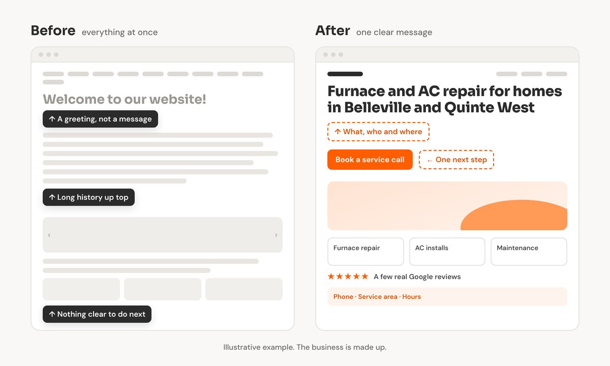
For example: “Furnace and AC repair for homes in Belleville and Quinte West.”
Or lead with the problem: “Wet basement? We waterproof homes across Prince Edward County.”
If you can't fit it in one sentence, that's worth noticing. It usually means the homepage is trying to say everything at once.
That sentence helps more than your visitors. Google and AI tools like ChatGPT read your homepage too, and a plain line about what you do and where is easy for them to pick up. I wrote more about that in what happens when someone asks ChatGPT for a business like yours.
What I Talk People Out Of
People are always asking me for “Welcome to our website” at the top, or a friendly greeting, or a few paragraphs explaining the business from the beginning. I tell them we're not going to add those.
The visitor already knows they're on your website. The top of the homepage is the first thing they see, and a greeting uses it up without telling them anything. Your one clear sentence belongs there instead.
Over-explaining has the same problem. The full story of the business, every service in detail, the history: all of it can be useful, just not on the homepage. Give it its own page and link to it.
What Goes Under the Headline
Once the message is clear, the rest of the homepage only needs a few things. Each one helps someone decide to get in touch.
- One next step. Call, book, or send an enquiry. Pick the one you want most and make it easy to find.
- An image that fits the message. A photo of your work, your team or your shop says more than a stock photo.
- Your main services, briefly. A line or two each, linking to a page with the details.
- A little proof. A few real Google reviews are enough. You don't need a wall of them.
- How to reach you. Phone, the area you serve and your hours, where people can find them without hunting.
If something doesn't help with one of those, it can probably live on another page.
Try This on Your Own Homepage
Open your homepage on your phone and look at it without scrolling. Could someone who has never heard of you tell what you do, where you do it, and how to get in touch? Better still, show it to a friend for a few seconds and ask them what your business does.
If the answer is fuzzy, start with the headline. It's often the one change that makes the rest of the page fall into place. If your site has other problems too, my post on why a website isn't bringing in customers covers the bigger picture.
Cleaning up homepages is a big part of the website design work I do. If you'd like a second look at yours, along with how your business shows up on Google, run the free checkup.
Want a cleaner homepage?
I can clear out the clutter, write one clear message about what you do, and make it easy for visitors to get in touch.